Liv Up — Shopping List optimization on a Foodtech
My role: Lead Product Designer — discovery through handoff, working alongside a PM and a data analyst.
Overview
- +13% average order value
- Among users who adopted the shopping list page.
- +20% item variety by repeat customers
- The direct metric we were optimizing for.
- +2 minutes average session time
- On purchases with a completed order, suggesting users were engaging with the new catalog rather than racing through checkout.
Development_
Liv Up built its reputation on curated, healthy frozen meals. During COVID we expanded the catalog to include traditional grocery items expecting customers to expand their shopping list but they didn’t.
When bought the new items were well-reviewed but they weren’t being bought enough. From previous data we knew that users who purchased a greater variety of items had significantly higher retention rates. So low variety was both a revenue problem and a churn signal.
Before - Around 100 items
 Frozen meals
After - Over 400 items
- Frozen meals
 Produce
 Dairy
Dairy Meats & Seafood
 Bakery and sweets
 Pantry
 Drinks
We ran interviews with repeat purchasers looking for patterns across users with similar purchase habits. The interviews confirmed what the data suggested: they weren’t avoiding new products, they weren’t seeing them.
The behavior that made them valuable customers, high intent and low friction also made the expanded catalog invisible to them.
Our users mental model of the app was “get my usual stuff, get out.” The app navigation was working against us.
So we thought, when do we present new products to repeat buyers without feeling intrusive or complicating their shopping and checking out routine to the point of raising churn rates?
At first we explored a Favorites page
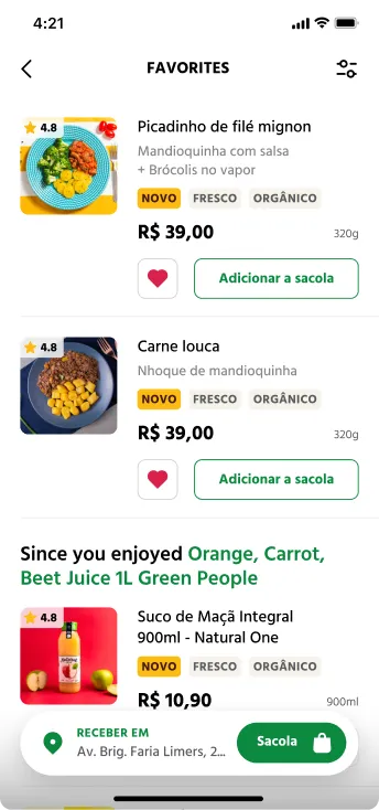
Giving users a place to save their commonly bought items and surface new items alongside them. The explorations looked right on paper, but when we reviewed them as a team, the “Favorites” framing created the wrong signal.
A page curated entirely around past purchases reinforced the exact tunnel vision we were trying to break. New items felt uncalled for rather than compelling.
Then moved the position of recommendations
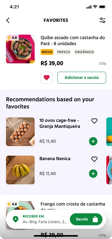
We tried moving the position of our recommendation. Instead of surfacing recommendations at the bottom of the list like it’s usually done, I moved it inline, positioned relative to specific items in the list.
The recommendation was contextual, a user who always bought a specific chicken dish would see a new protein suggested next to it, not in a generic “you might like” section with several other categories of items.
Pivoted to a shopping list that encourages the discovery of new products
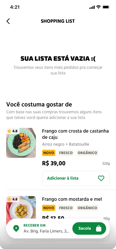
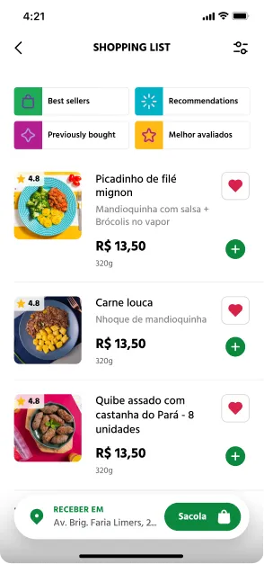
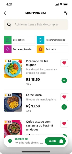
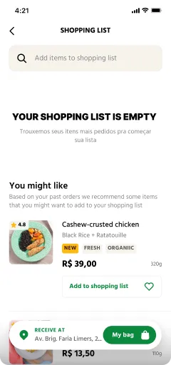
From there we expanded the section into a shopping list hub. Renaming the section from “Favorites” to “Shopping list”. A subtle shift that changed the mental model from “things I like” to “things I’m going to buy”. The empty state seeded the list with items from past orders, giving returning users a starting point instead of a blank screen.
Discovery shortcuts — New arrivals, Recommended, Previously bought, Best reviewed — gave users explicit paths into the new catalog without forcing exploration.
Finally, we adapted search, by adding a search function so users could search for items to add to their shopping list or shopping cart without leaving this page thus streamlining their experience.